Master Visual Design Principles: A Complete Guide to Creating Stunning Designs

Visual design is everywhere around us – from the apps on your phone to the billboards on your commute. Yet mastering the principles that make designs truly effective remains a mystery to many. Whether you're a budding designer, entrepreneur, or simply someone who wants to communicate more effectively through visuals, understanding visual design principles is your gateway to creating compelling, professional-looking designs. This comprehensive guide will take you through six progressive steps, from fundamental concepts to real-world application, ensuring you develop both the theoretical knowledge and practical skills needed to excel in visual design. View original learning path
Step 1: Understand the Basics of Visual Design
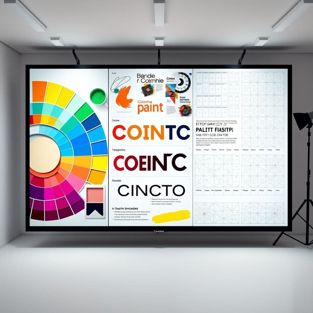
Before diving into complex design projects, you need to establish a solid foundation in the three pillars of visual design: color theory, typography, and layout composition. Color theory teaches you how colors interact, evoke emotions, and create visual harmony. Start by learning the color wheel, understanding warm versus cool colors, and exploring complementary, analogous, and triadic color schemes. Typography goes beyond just picking pretty fonts – it's about understanding how letterforms communicate tone, hierarchy, and brand personality. Learn to distinguish between serif, sans-serif, script, and display fonts, and understand when to use each. Layout and composition form the structural backbone of your designs, teaching you how to arrange elements in a way that guides the viewer's eye and communicates your message effectively. Practice the rule of thirds, understand focal points, and experiment with different grid systems to organize your content logically.
Step 2: Learn the Principles of Visual Design
Now that you understand the basic elements, it's time to learn how to use them effectively through the five core principles of visual design. Balance creates stability in your designs – whether through symmetrical balance for formal, traditional feels, or asymmetrical balance for dynamic, modern compositions. Contrast is your tool for creating visual interest and hierarchy; use it through color, size, shape, or typography to make important elements stand out. Hierarchy guides your viewer's eye through your design in order of importance, typically achieved through size variations, color emphasis, and strategic positioning. Repetition creates unity and consistency throughout your design by repeating colors, fonts, shapes, or spacing patterns. Proximity groups related elements together, helping viewers understand relationships between different pieces of information. Practice these principles by analyzing designs you admire and consciously applying each principle in small design exercises.
Step 3: Study Design Elements and Their Relationships
✨ This guide exists as a free, trackable step-by-step path
Open the Interactive Path →Design elements are the building blocks you'll use to construct compelling visuals. Lines can be literal or implied, creating movement, direction, and emotional impact – thin lines suggest elegance and delicacy, while thick lines convey strength and boldness. Shapes carry psychological weight: circles suggest unity and completeness, squares represent stability and reliability, while triangles create energy and movement. Texture adds tactile quality to your designs, whether through actual textural elements or the illusion of texture through patterns and techniques. Space, particularly negative space, is just as important as the elements you include – it provides breathing room, creates emphasis, and can even form shapes and meanings of its own. Understanding how these elements interact and support each other will elevate your designs from amateur to professional. Practice by creating compositions using only one element at a time, then gradually combining them to see how they influence each other.
Step 4: Explore Visual Design Principles in Practice
It's time to put theory into practice by mastering the practical applications of design principles. Visual hierarchy becomes your roadmap for guiding attention – establish clear primary, secondary, and tertiary levels of information through size, color, and positioning. Grid systems provide the invisible structure that makes your designs feel organized and professional; experiment with column grids, modular grids, and baseline grids to understand how they influence readability and visual flow. Color schemes move beyond basic color theory into sophisticated palettes that serve specific purposes – monochromatic schemes for elegance, complementary schemes for high energy, and analogous schemes for harmony. Typography pairing is an art form that requires understanding how different fonts complement or contrast with each other; learn to pair a strong headline font with a readable body font, ensuring they share similar characteristics while providing appropriate contrast. Whitespace, or negative space, is your secret weapon for creating sophisticated, uncluttered designs that feel premium and easy to navigate.
Step 5: Develop a Critical Eye for Design
Becoming a skilled designer requires developing the ability to see and analyze design critically. Start by studying design examples from various industries – websites, posters, packaging, apps – and identify which principles are at work. Ask yourself: What makes this design effective? How does it guide my eye? What emotions does it evoke? Practice giving and receiving constructive feedback by joining design communities, participating in critique sessions, and learning to articulate what works and what doesn't in specific, actionable terms. Embrace the iterative design process as your pathway to excellence; great designs rarely emerge fully formed but evolve through multiple rounds of refinement. Create several versions of the same design, each addressing different aspects or exploring alternative approaches. This critical analysis skill will help you make informed design decisions rather than relying solely on personal preference or trends.
Step 6: Apply Design Principles to Real Projects
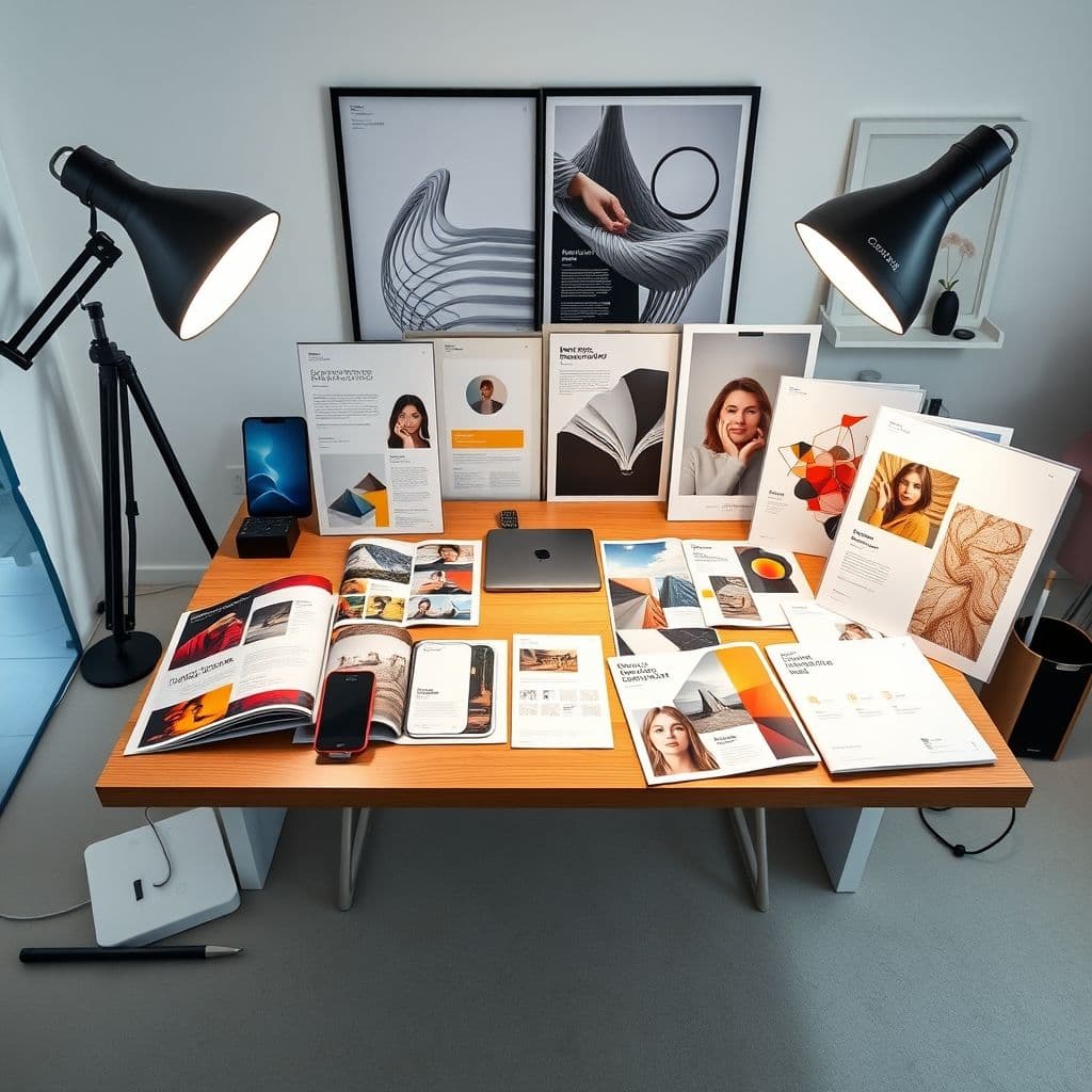
The culmination of your visual design learning journey is applying your knowledge to real-world projects. Start with mood boards to establish the visual direction and emotional tone of your projects – collect images, colors, textures, and typography that capture the desired feeling and aesthetic. When designing user interfaces, apply your hierarchy and spacing principles to create intuitive, user-friendly experiences that guide users effortlessly through digital interactions. Marketing materials require understanding how design supports persuasion and communication goals – use contrast and hierarchy to highlight key messages, and select colors and fonts that align with your audience's expectations and desires. Brand identity design challenges you to distill complex company personalities into cohesive visual systems that work across multiple touchpoints and applications. Each project type has its unique constraints and objectives, but the fundamental principles you've learned provide the framework for success regardless of the medium or industry.
Conclusion
Visual design principles are not just academic concepts – they're practical tools that transform good ideas into compelling visual communications. By progressing through these six steps, you've built a comprehensive understanding that spans from fundamental elements to real-world application. Remember that mastering visual design is an ongoing journey of observation, practice, and refinement. The principles you've learned provide the foundation, but your unique perspective and creative voice will determine how you apply them. Continue studying designs you admire, seek feedback on your work, and most importantly, keep creating. Every project is an opportunity to strengthen your skills and develop your design intuition.
Ready to put your visual design knowledge into practice? Start with a simple project and share your progress with the design community – your journey to design mastery begins with the next design you create!
🚀 Follow This Path FreeFrequently Asked Questions
- How long does it take to master visual design principles?
- While you can learn the basics in a few weeks, mastering visual design is a lifelong journey. Most designers see significant improvement within 3-6 months of consistent practice, but developing an expert eye and intuitive design sense takes years of experience across diverse projects.
- What are common mistakes beginners make when learning design principles?
- Common mistakes include over-designing with too many fonts or colors, ignoring whitespace, lacking clear hierarchy, and following trends without understanding underlying principles. Focus on simplicity, consistency, and purposeful design decisions rather than trying to use every technique at once.
- Do I need expensive software to practice visual design principles?
- Not at all! You can practice design principles using free tools like GIMP, Canva, or even pen and paper. The principles themselves are software-independent – understanding color, typography, and layout is more important than mastering specific tools.
- How do I know if my designs are actually following good design principles?
- Seek feedback from other designers, use design principle checklists to evaluate your work, and compare your designs to professional examples in your industry. Also, test your designs with real users to see if they communicate effectively and achieve their intended goals.
Recent Posts